Posts

Portfolio

Image
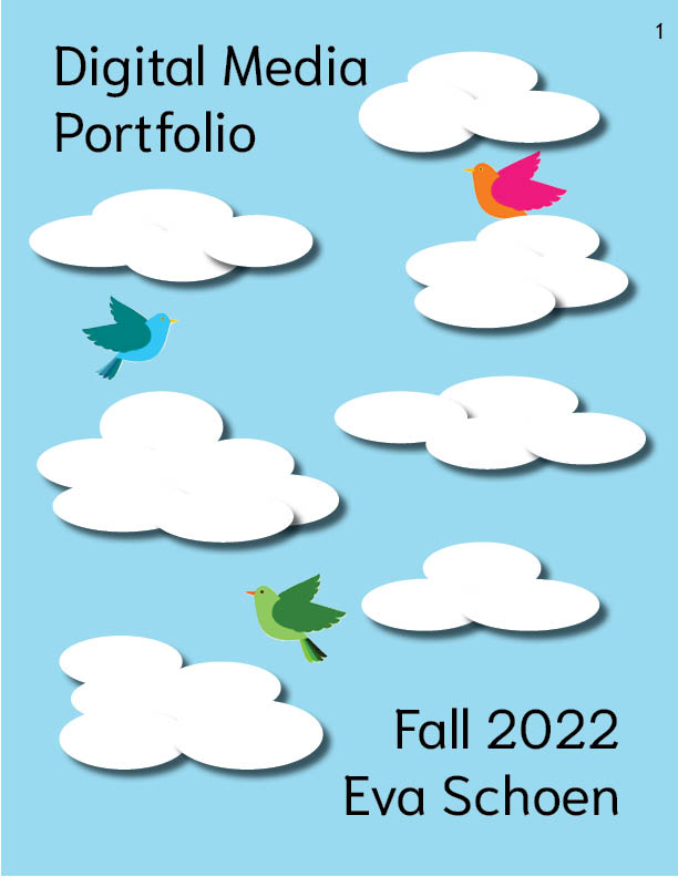
For my final portfolio, I wanted to do something nature related. I've tried incorporating nature into almost all of my projects, and I wanted this one to do the same. I chose a sky theme, because I could add flying birds, which are my favorite animals. I put the projects in timeline order from this year, because I think going in order shows my progress the best. My first project wasn't the best, but once I got to the end, you can see how much I improved. I had a fun time doing the portfolio because I got to really see all my work together, and think about how much I've done in only one semester. 
Business Cards

Image
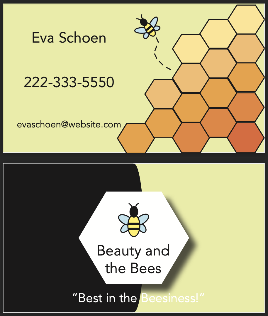
For my business cards, I wanted to do something bee-related. Almost all of my projects have had something to do with nature, and I wanted my last solo project to do the same. I chose bees because I had been reading an article about what it would mean if bees were to go extinct. This project was pretty easy for me, because there wasn't much to do that was hard besides making the images and logos. I liked coming up with layouts that weren't standard and basic, because it made the cards more interesting to look at. 

BW to Color

Image
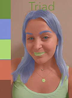
For this project, I had to take a picture of myself and adjust all of the colors. This project was hard for me, because the brush tool that I had to use to select certain parts was not very easy to control. It would select or deselect certain parts that I needed, so it took a lot of adjusting to get it right. Overall, I think these turned out well. I tried to use colors that I thought would look more realistic for skin tone and hair. I had fun doing this project and would definitely try something like it again. 

Indesign

 https://www.youtube.com/watch?v=0eqhUFRlvgI I think the Pages tab will be helpful, especially for when we create our portfolios. This separates the different pages for a project, for things like magazine or journal designs. It will be easy to set my pages apart for my portfolio and design them separately but in the same file.  https://www.youtube.com/watch?v=5Z3ZQmFM9LM The grid layout will be very helpful for designing pages. I'll be able to see how each of my pictures and the text will fit together, and measure it out beforehand so I won't have to keep adjusting throughout the process.  https://www.youtube.com/watch?v=TU3C8rNAP3U Being able to add little symbols will help my portfolio to stand out. We did this a little bit in our example layout, and it's something I definitely want to incorporate into my own work. These add some life to the pages, outside of just text and the pictures of my projects. 

Somewhere Project

Image
I wanted to put myself into a superhero show, because I love this genre and think it's fun to imagine myself with superpowers. I put myself into a scene from The Defenders, because there was a gap in this elevator scene that I thought I would fit nicely into. This was one of my favorite projects to work on, because I got to put myself into a different world and I think it turned out really well. The hardest part for me was blending the edges of my picture into the background image, because the tools weren't working exactly how I wanted them to. Overall, I had a good time working on the Somewhere project and would definitely try something like this again. 

Photoshop Part 2

Image
  I think this picture would be difficult to Photoshop myself into. There isn't a lot of extra space for me to fit in, and the shadows are very hard which I think would give me some trouble.  This picture inspired me for my Somewhere project. I think it would be a good idea to Photoshop myself into a scene where there aren't too many background objects. I wouldn't have to squeeze myself between anything that way, and could just put myself in however I look in my starting image.  This picture made me laugh. It shows how many possibilities there are in Photoshop. You can edit things to look any way you want. I think a rainy effect would be interesting to try to recreate. I love the rain and think it would be fun to try to make my own on Photoshop. 

Photoshop

 https://www.youtube.com/watch?v=KAmSB5MQxOo     This video explained tools such as vibrance and saturation. I think these will be easy to brighten and darken images, so you don't have to individually change each color. They will be helpful for editing the whole image in one move. You can also easily use text in Photoshop in a similar way to Illustrator, so I think that should be easy enough to use.  https://www.youtube.com/watch?v=TA8IdkF559s     I think using layers will be a challenge for me. When I was working on my Illustrator project, sometimes my outlines would end up in different layers and I would have to manually move them around. The layers are helpful for sorting our different sections of the work, but I found them stressful. I think having to use over 50 layers will be difficult and might make this project harder for me to do successfully.  https://www.youtube.com/watch?v=61mkx_OV61s      The undo button will be helpful because I found myself making a lot of small mist